Rebranding Localie: how we created a strong brand for a global community

We’re Busy — a design studio working with growing teams. We create branding, build websites, and provide ongoing design support, helping companies scale without adding complexity.
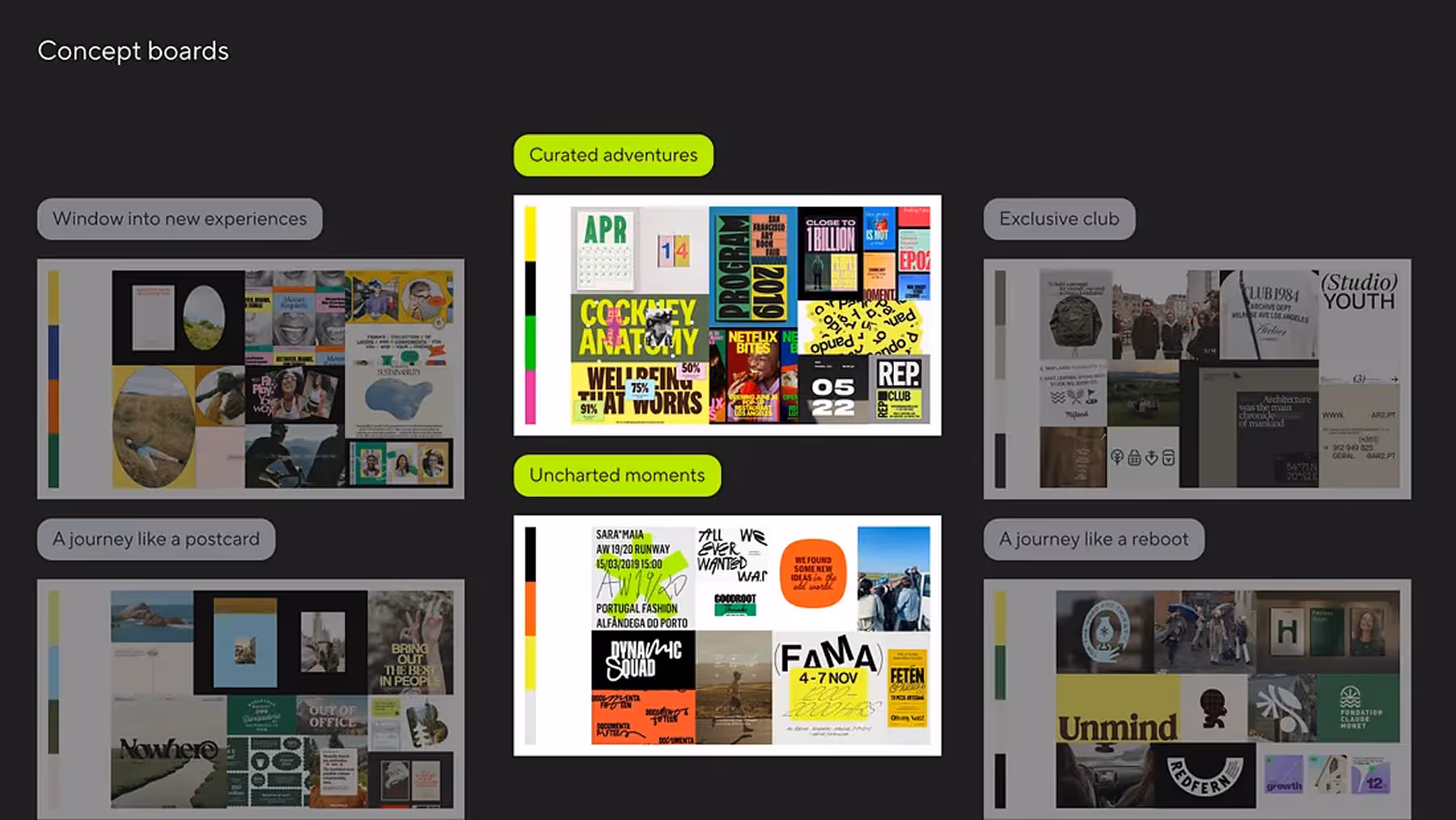
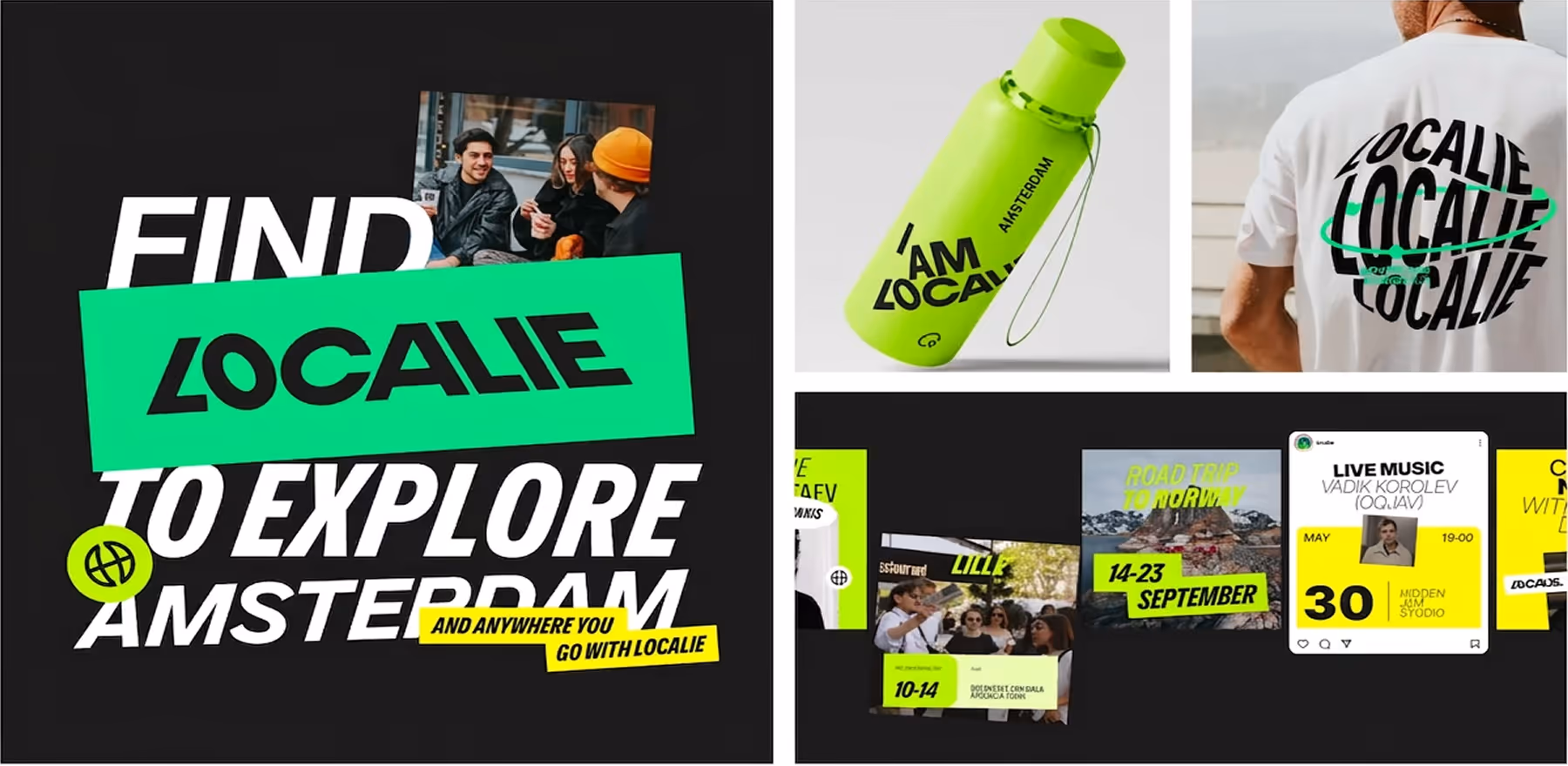
We created multiple concept boards, each offering a different metaphor. Some ideas centered around Localie as an exclusive club, others as a window into new experiences. Ultimately, we landed on the metaphor of “Curated Adventures with Uncharted Moments.” This concept captures how Localie blends structured, well-planned events with spontaneous, unexpected adventures — where every trip or event has its own special touch.
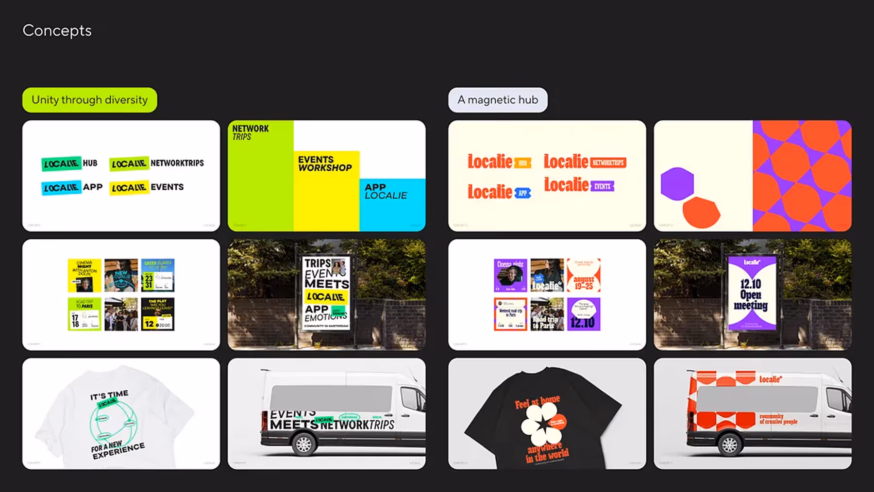
Both concepts were inspired by Amsterdam’s cultural design style, and during the presentation, Localie’s team chose the first concept as the bolder, stronger option. From there, we moved forward with creating the brand guidebook.
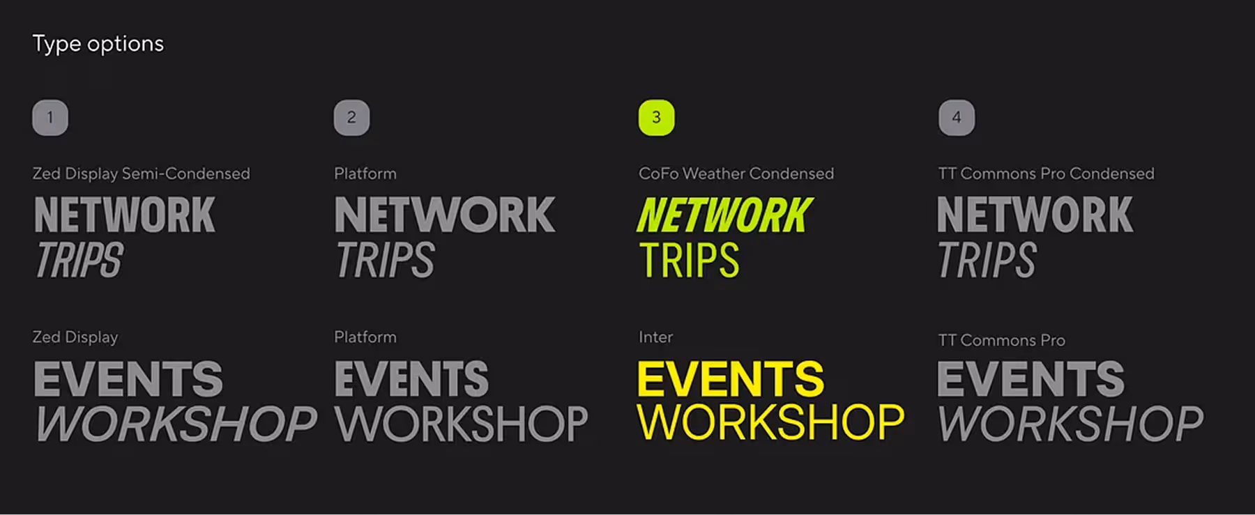
After exploring over 30 combinations, we selected four final fonts that were scalable and reflected the brand’s boldness.
We chose a vibrant combination of blue, green, and yellow to make Localie stand out and capture its energetic and adventurous spirit.

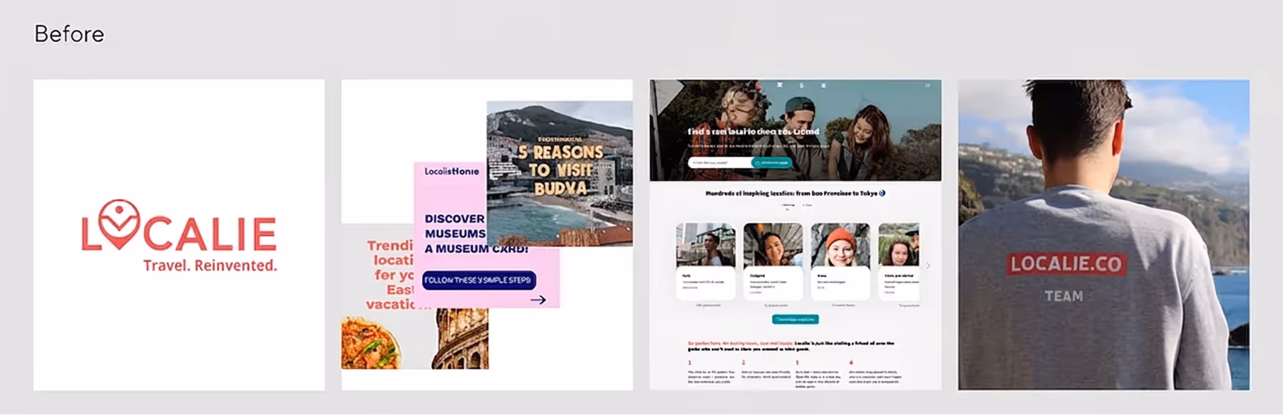
Our previous logo and visual identity were created back in 2017 — around the time the idea for Localie first came to life. Since then, so much has changed. That original logo was the result of early experiments by a team with no product experience yet. It held a lot of sentimental value, but over time, it no longer matched the product, our style, or the current stage of the company.
We knew it was time for Localie to look different. But trusting someone else with this task was difficult — no one knows or feels the product like we do.
When we met Julia and Masha from Busy Studio, it was love at first sight. They didn’t just jump into the task — they took the time to understand our product first. They became true ambassadors of the brand, and we felt that they genuinely understood what we’re building. That, to us, is the most important thing in creating a strong visual identity.
Eventually, we asked Busy Studio to handle the full rebranding, including the new logo and style. It was also a chance for us to see our product from a fresh perspective — through the eyes of users and creatives outside our team. Julia and Masha brought a vision we immediately connected with.
Honestly, the hardest part was choosing between the design directions — each one was thoughtful and captured a different facet of our product. We also really appreciated how structured and professional the whole process was. As a busy startup, we weren’t always able to stay fully focused on the branding process — but Busy Studio took the lead, guided us gently, and made everything run smoothly.
In the end, we received a visual identity we’re truly proud of. And we’re happy to keep working with Busy Studio on future projects to come.