From a small design task to a long-term design partnership

In this project, we helped UNOWA move from fragmented design efforts to a system that scales — with a clear visual direction, a flexible website, and ongoing support embedded into their workflow. The goal was not just to improve how things look, but to make design easier to manage as the company grows.
UNOWA works with governments and institutions to implement inclusive education systems at scale. Their solutions combine STEM equipment and AI-driven tools, helping bring inclusive classrooms to schools across different countries.
Today, their work spans 37 global projects, 545 national initiatives, and nearly 15,000 trained teachers.

Our collaboration started with a small task — redesigning a presentation within their existing visual style.
When a new request came up — a one-pager — they returned to us. But this time, they wanted something more expressive, but still aligned with their positioning: professional, structured, and suitable for the education space.
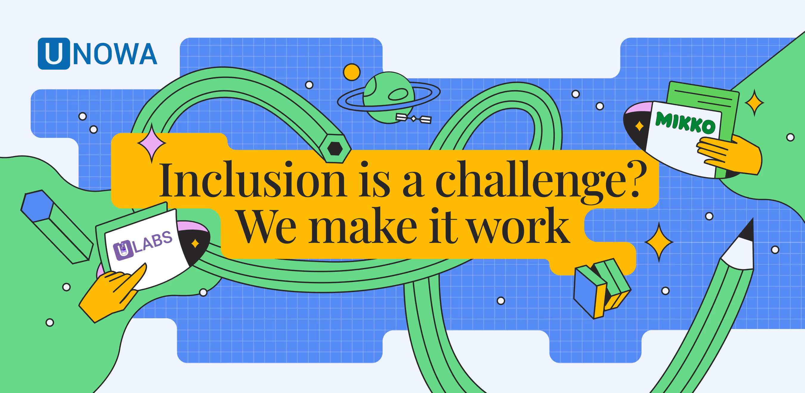
It became clear that the existing style is not enough. The visual language itself needed to evolve to reflect the product and scale with it.
Instead of proposing a full rebrand, which is pricey, long and often doesnt work for scaleups like UNOWA we suggested to quickly explore several visual directions and test them directly on the one-pager.
We developed three concepts, each emphasizing a different aspect of the brand:
We started with moodboards to align on the overall tone and understand what felt closer to the team. We iterated together in sync calls, gradually refining the directions into more concrete concepts.
From there, selected elements were combined into a final direction and applied to a real one-pager layout. This made the design practical and helped the team see not just how the brand looks, but how it performs in context.
The entire process, from exploration to alignment including several refinements and syncs, took three days.

The approved visual direction extended into a larger project — a full website redesign.
The team wanted to move away from WordPress and build a system they could manage independently, without relying on designers or developers for every update. At the same time, the website needed to support a growing product catalog and remain flexible as the company expanded.
We chose Webflow as the main platform and structured the work in two stages. The first stage focused on launching the key pages in time for an upcoming exhibition, while the second stage covered the expansion of the site and additional functionality.
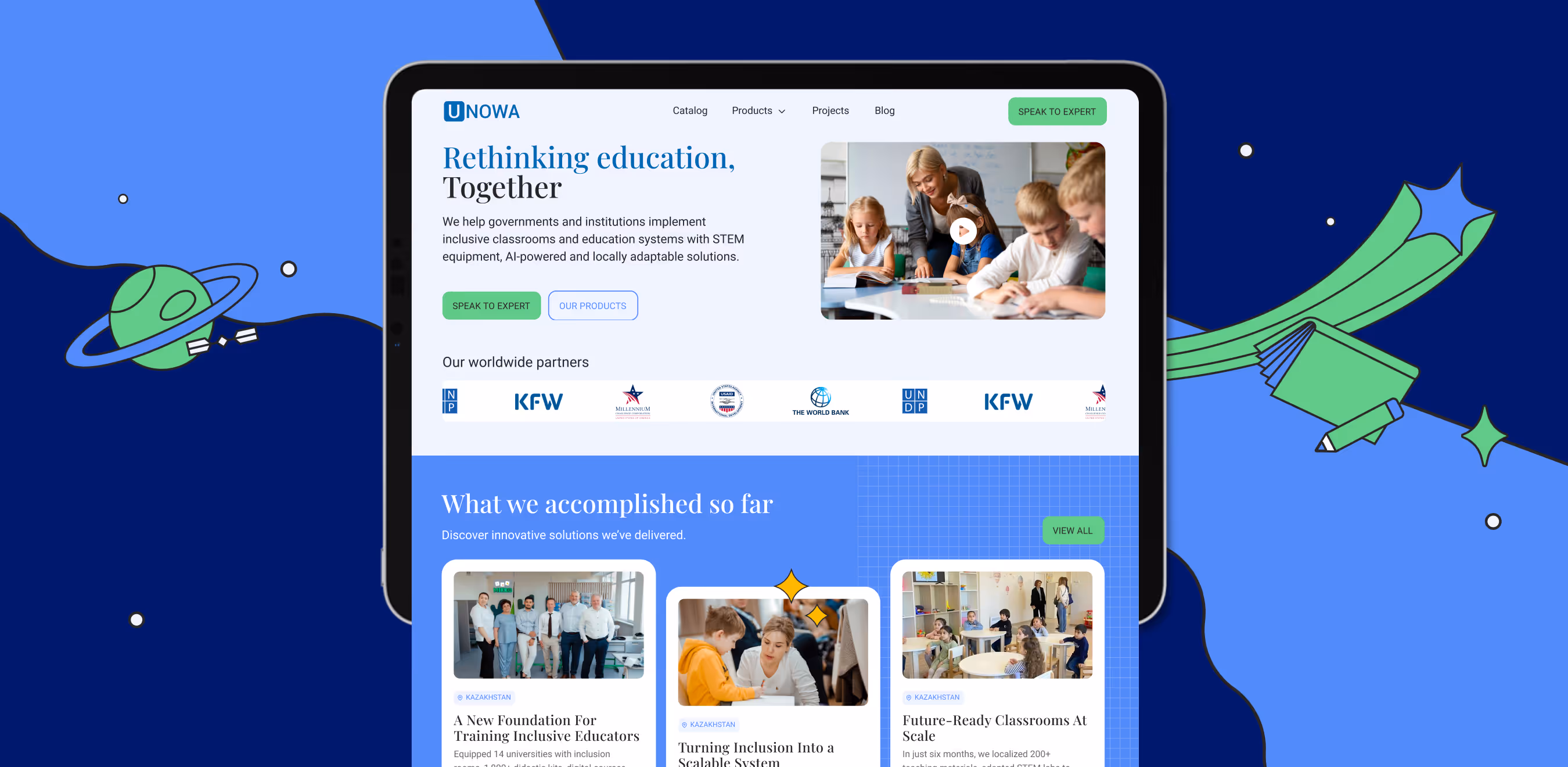
A significant part of the work went into designing and implementing the product catalog.
The structure had to support a complex hierarchy of products, filtering, and different types of content, while still remaining easy to manage. We built a CMS system in Webflow that allows the team to create product pages, update content, and manage the catalog without external help. Filters and categorization were configured to reflect how users actually navigate the products.
Today, product managers and marketers work directly with the CMS:
We also prepared CSV templates for bulk uploads and conducted walkthrough sessions with the team. After launch, we continued refining the system based on real usage — adjusting fields, filters, and page logic as new needs emerged.
Before that, the CMS existed but wasn’t fully usable for the team. Now it’s part of their everyday workflow, and updates no longer depend on long development cycles.

For the past nine months, we’ve been working with the team as an ongoing design partner. They don’t have an in-house design team, so we cover a wide range of needs — from presentations and marketing materials to social media templates and exhibition assets.
We are integrated into their internal workflow: connected to their task manager, communicating directly in messengers, and responding quickly during working hours. Each request goes through a dedicated project manager on our side, who tracks timelines, priorities, and budgets.
In our weekly reports, we break down work by project, so each stakeholder can see exactly how much time was spent on their specific tasks. This makes it easier for the team to manage priorities without additional overhead.
At some point, the team started referring to us as their design partners — and treating us as part of the team.

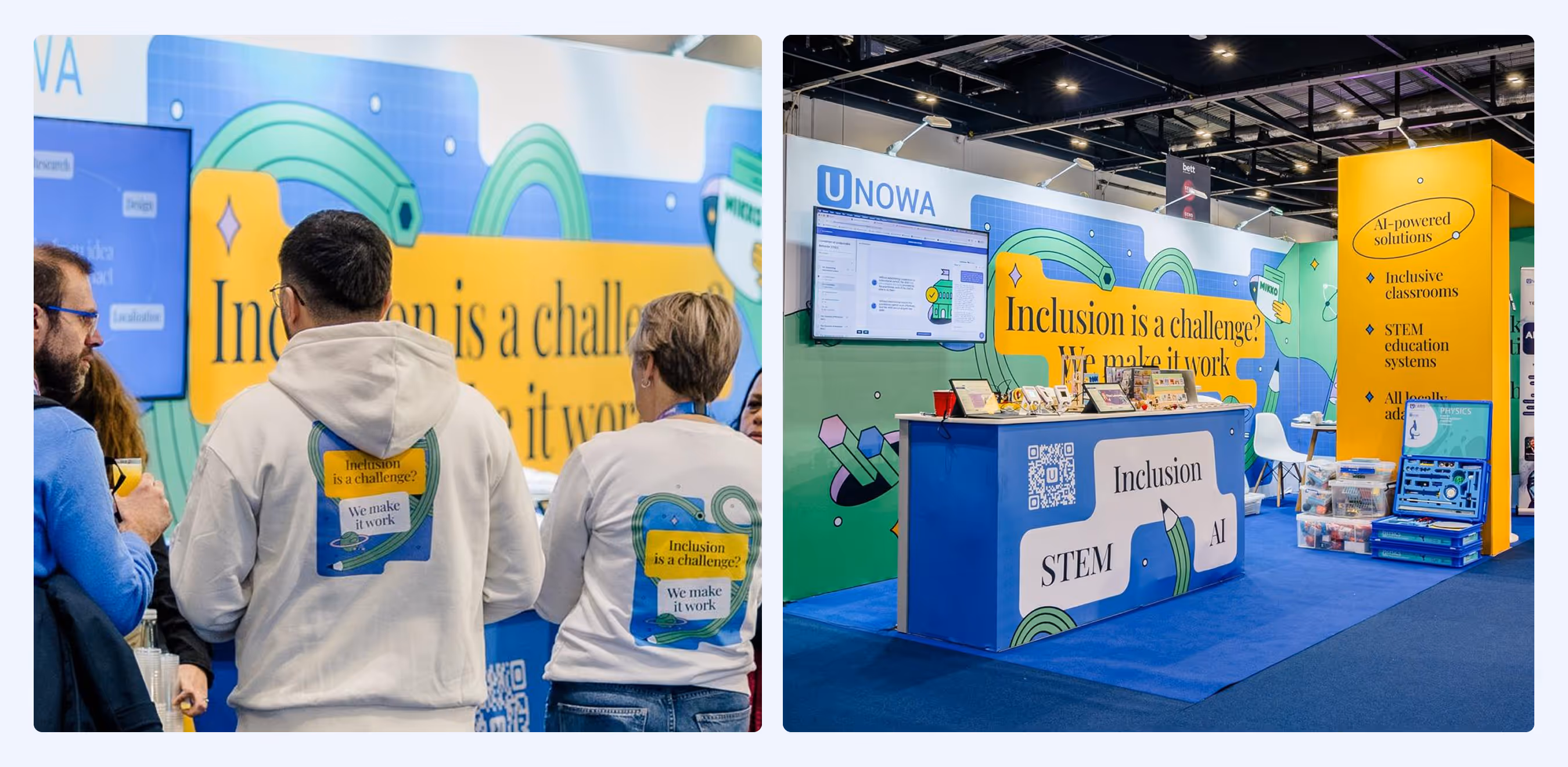
At one of the exhibitions, the team collected over 260 contacts, around 50 of which matched their target audience.
The booth stood out among many similar setups, attracting attention and bringing people in. While design is not the main driver at such events, it plays a key role in creating that first point of engagement.
Beyond measurable results, the biggest impact has been operational.
We continue working with the team on new materials and are currently developing branding for another internal product, expanding the system we built together.
They were fast — proposing changes and implementing them without back-and-forth. The hardest task was to adapt old branding to a fresh perspective without complete overhaul. Guys at busy handled it extremely well and brought their expertise to the table. The design they created scales cleanly across everything we throw at it. And the brand now looks sharp and cohesive everywhere. They completely took design off my plate. No hiring, no managing a design team, no context-switching. I just handed them problems and got solutions. For a startup CMO juggling ten things at once, that's worth more than the work itself.
We collected 260+ contacts at one of the exhibitions — around 50 of them our exact target audience. The booth did its job. Bright, impossible to miss, and it stood out hard against a sea of generic white-and-blue stands. People walked over just to see what we were about. Design isn't supposed to be the hero at a trade show — your product is. But good design gets people to stop. And they stopped.